

Kotlin Notebook
Run this tutorial as a Kotlin Notebook with interactive Kandy charts — all code cells, DataFrame outputs, and visualizations included.
- E-commerce Landing Page (Kaggle) — ~294K users randomly assigned to old vs new checkout page, binary outcome (converted / not)
- Marketing Campaign (Kaggle) — daily campaign metrics (spend, clicks, impressions, purchases) for control vs test campaign
- Act 1 — Binary metric: conversion rate (proportion z-test, chi-squared, Bayesian)
- Act 2 — Rate metrics: CTR, purchase rate (paired t-test, Wilcoxon, effect sizes, correlation)
This tutorial uses Kotlin DataFrame for data loading and Kandy for visualization. These are Kotlin Notebook dependencies — the kstats statistical functions work in any Kotlin environment.
Quick Reference: Which Test to Use?
Act 1: Binary Metric — Conversion Rate
1. Data Loading and Cleaning
Dataset: ~294K users randomly assigned to control (old page) or treatment (new page), binary outcome (converted / not).
The dataset has 294,478 rows and 5 columns with an overall conversion rate of ~12%.


2. SRM Check — Sample Ratio Mismatch
Before any hypothesis test, verify that randomization worked correctly. If the split ratio deviates from 50/50 more than chance would allow, the experiment is compromised — all downstream results are untrustworthy. is checked with a one-sample proportion z-test: is the observed split consistent with a 50/50 ratio?3. Power Analysis — Pre-Experiment Planning
should happen before data collection to determine the required sample size. We ask: “How many users do we need to detect a 1 percentage point lift from a 12% baseline with 80% power at alpha = 0.05?” This ensures the experiment is neither underpowered (missing real effects) nor wasteful (running longer than necessary).

4. Primary Test — Two-Sample Proportion z-Test
The core question: is the conversion rate different between control and treatment? For comparing two binomial proportions on large samples, the proportion z-test is the standard method. It compares the observed difference against sampling variability under the null hypothesis of equal rates.One-sided check
The company only cares if the new page is better. A one-sided test has more power to detect an improvement, but p ≈ 0.905 here strongly suggests the treatment is actually worse (or at best equal).5. Effect Size — Cohen’s h
A answers “is there a difference?”. answers “how big is the difference?” With N=290K even tiny differences can become “significant”. Cohen’s h puts the difference on a standardized scale independent of sample size.

6. Confidence Intervals — Wilson Score
The Wald CI from the z-test can misbehave near 0 or 1. The Wilson score interval is recommended for per-group conversion rate estimates, especially with small samples.7. Robustness Check — Chi-Squared Test
The same hypothesis can be tested with a 2x2 contingency table. For large N the chi-squared statistic equals z² — a useful sanity check.8. Bayesian A/B Testing
The frequentist approach gives a binary answer: reject or don’t reject. The Bayesian approach answers a more intuitive question: what is the probability that the treatment is better? We use the Beta-Binomial conjugate model:- Prior: Beta(1, 1) — uninformative (uniform on [0, 1])
- Posterior: Beta(1 + successes, 1 + failures) — updated belief after seeing data
- Decision: Compare posterior distributions via Monte Carlo sampling


- Frequentist: “We cannot reject H₀” — binary decision, p-value depends on sample size
- Bayesian: “There’s a ~9.5% chance the new page is better” — direct probability statement, more intuitive for stakeholders
Act 2: Continuous Metrics — Marketing Campaign
We now switch to continuous metrics where different statistical tools are needed. Dataset: Marketing Campaign A/B Testing — daily campaign metrics for control vs test campaign over 30 days.9. Compute Rate Metrics
10. EDA — Paired Differences
Before running hypothesis tests, visualize the data to understand its structure and spot potential issues.- CTR
- Purchase Rate
Strip plot with mean ± SE — each dot is one day; the treatment mean is clearly higher, but individual days vary widely.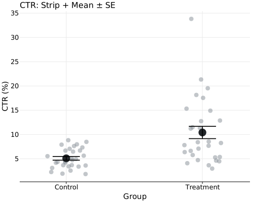
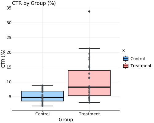
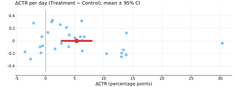


11. Assumption Checks
For paired tests, we check the differences (treatment minus control per day):- Normality of differences (Shapiro-Wilk) — are the paired differences approximately normal?
- Homogeneity of variance (Levene) — reported for completeness, though paired tests do not require it.
- Shapiro-Wilk on differences passes (p > 0.05) → paired t-test is primary
- Shapiro-Wilk fails → paired t-test is often robust to mild non-normality, but at N ≈ 29 results should be interpreted cautiously. The Wilcoxon signed-rank serves as a sensitivity check — if both tests agree, the conclusion is more trustworthy
- No need to check equal variances — paired tests work on differences, not separate groups
12. Hypothesis Tests — Paired t-test and Wilcoxon Signed-Rank
13. Effect Size — Paired Cohen’s dz
For paired designs, Cohen’s dz = mean(differences) / SD(differences) is the appropriate effect size. It captures how large the within-pair differences are relative to their variability.
14. Multiple Comparison Correction
We tested two metrics: CTR and Purchase Rate. Testing multiple hypotheses inflates the chance of false positives (Type I error). Three correction methods:
Use FWER (Bonferroni/Holm) when any false positive is costly (e.g., regulatory). Use FDR (BH) when screening many metrics and can tolerate some false positives.


15. Metric Correlation — CTR vs Purchase Rate
Are our two test metrics correlated? Bonferroni controls FWER regardless of dependence structure, but when metrics are positively correlated the correction becomes more conservative than necessary.


Summary
Caveat on Act 2 power: With only ~29 matched pairs, the study has moderate power (~55% for a medium effect dz ≈ 0.4). The significant results correspond to medium-to-large effects (dz ≈ 0.59-0.75), well above the detectable threshold. Nevertheless, the wide confidence intervals reflect the small sample.
Business conclusion: The new landing page does not improve conversion rate — the experiment was well-powered (>99% to detect a 1 pp lift) and both frequentist and Bayesian analyses agree. For the marketing campaign, both CTR and purchase rate are significantly higher in the treatment group after Holm correction for multiple comparisons. However, with only 29 matched days the effect size estimates are imprecise; a longer experiment would narrow the confidence intervals and confirm the magnitude of the improvement.
See Also
A/B Testing How-To
Concise step-by-step guide for running A/B tests with kstats using synthetic data.
Testing Assumptions
Verify normality, variance homogeneity, and distributional fit before applying parametric methods.
Hypothesis Testing Module
Full reference for all hypothesis tests available in kstats.
Correlation Module
Pearson, Spearman, and Kendall correlation with significance tests.